Whitefish Bay Transitional Kitchen, Back Entry, and New Garage
Project Overview
A previous remodel of this beautiful Tudor home had made a mess of several spaces. The kitchen and entry areas were cramped and aesthetically out of place with the home. This left spaces feeling out of place. Additionally, the original garage had been removed years earlier and instead, a long and narrow tandem garage had been installed in its place. Overall, this back corner of the home was cramped, cluttered, unattractive, and inefficient.
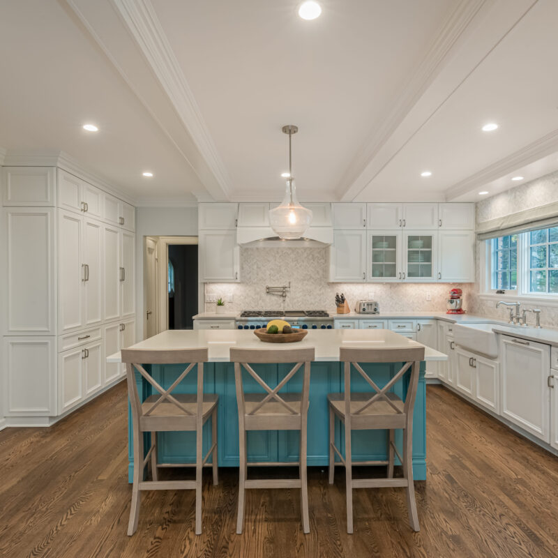
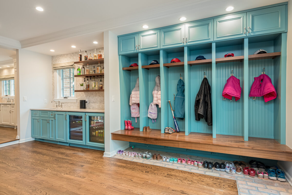
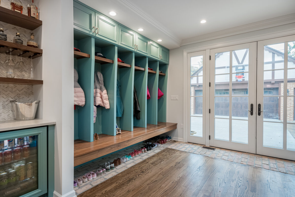
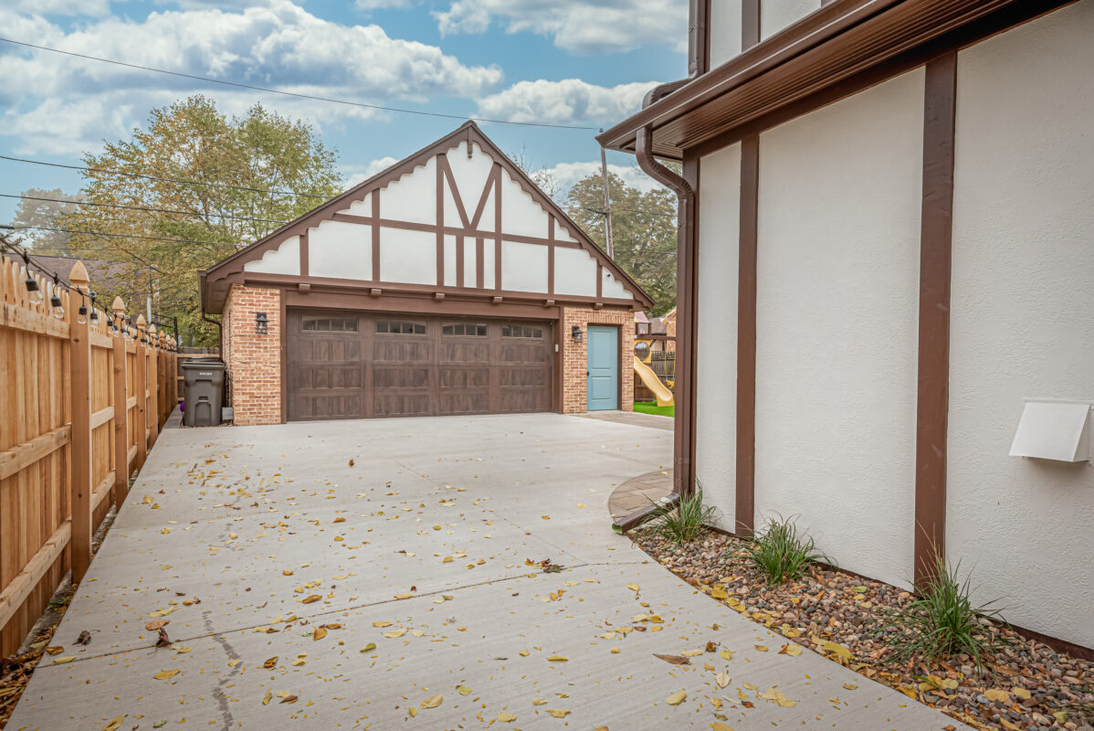
Our clients wanted a new design to incorporate a transitional style; one that brings characteristics from the original architecture and combine it with a modern and bright feel. The new design and layout eliminated the garage and utilized some square footage from that area to increase the kitchen and back entry space. A new 2 car brick garage was built, set back from the home. The allowed for a new back entry that features built in lockers, storage, and plenty of space for the family, which includes four children and two dogs.
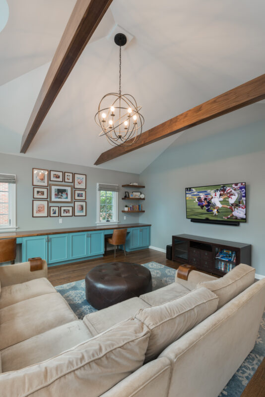
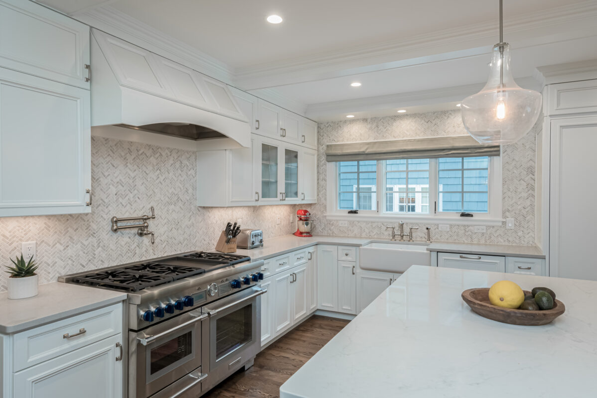
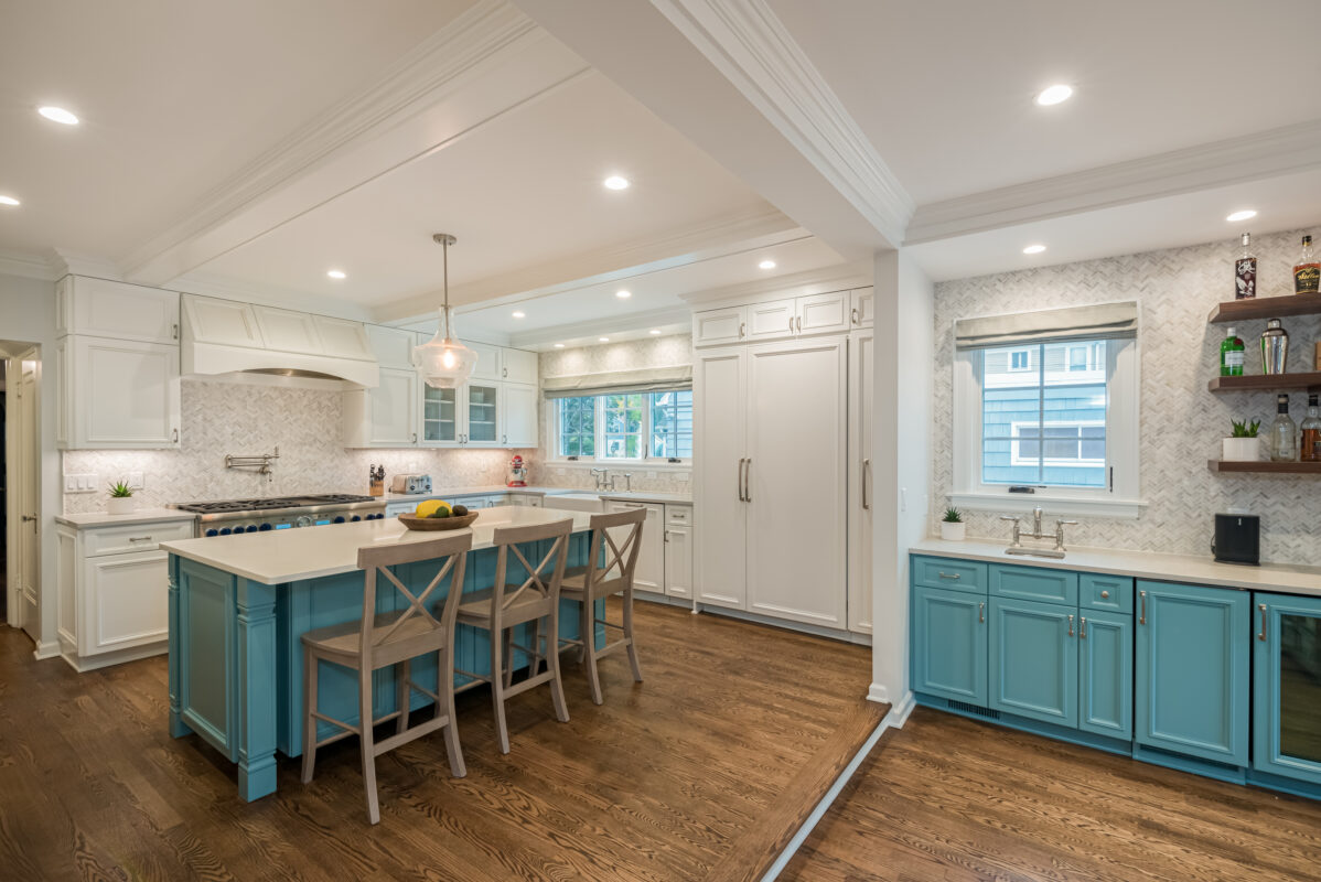
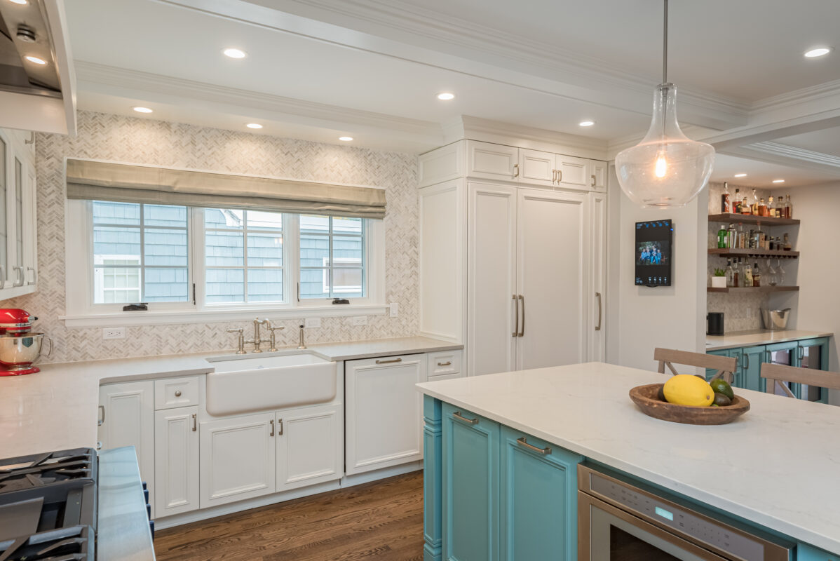
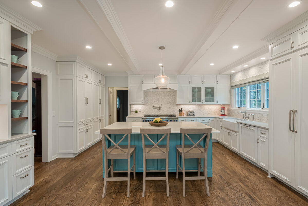
The new kitchen has a large island and functional work areas, allowing for easy access to cook, clean, up, or simply enjoy time together. The family room was also improved, with walnut wrapped beams and new cabinetry to compliment the adjacent kitchen and mudroom spaces.
Details
2021 NARI Milwaukee Remodeler of the Year: Residential Interior - Gold Award
2022 NARI Regional CotY Award: Residential Interior
Type of Home: 1930’s Whitefish Bay Tudor
Areas Remodeled: Kitchen, Family Room, Mudroom/Drop Zone
Project Size:
Interior: approx. 500 sq. ft.
Garage: approx. 675 sq. ft.
Design Partner: Davis Design Studio
Year Completed: 2020
Features
Apron Sink
Herringbone Tile
Tray-Style Ceiling Beams To Hide Structural Headers
Thermador® Appliances With Cabinet Panel Fronts
Custom Cabinetry
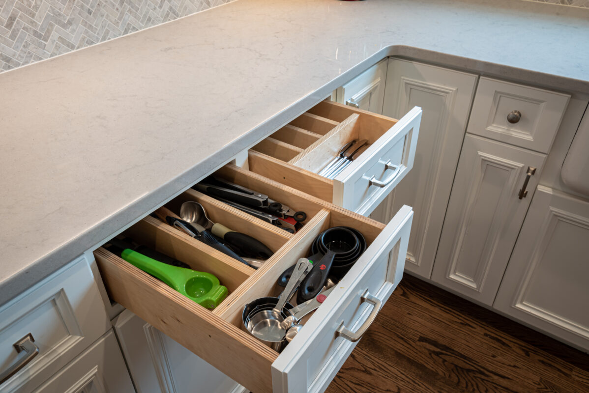
Custom Drawer Inserts
Restored Brick On House And At Interior Wall
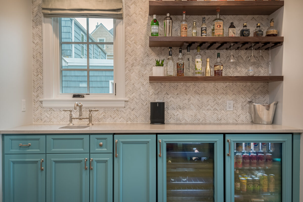
Beverage Center With Ice Maker And Separate Wine And Soft Drink Refrigerators
Mudroom Cubby Organization
New Brick Garage With Upper Storage
New Windows And Significant Exterior Repairs
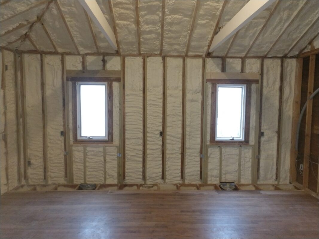
New Closed Cell Insulation For Energy Efficiency
New And Refinished Oak Flooring
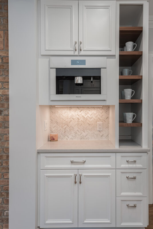
Meile® Built-In Coffee/Espresso Machine At Coffee Center
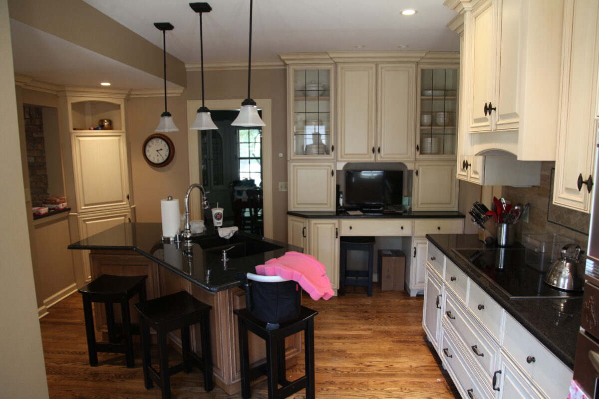
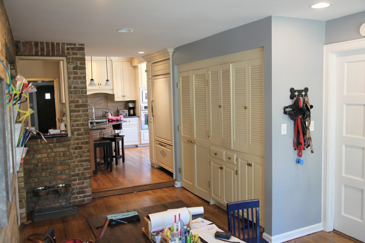
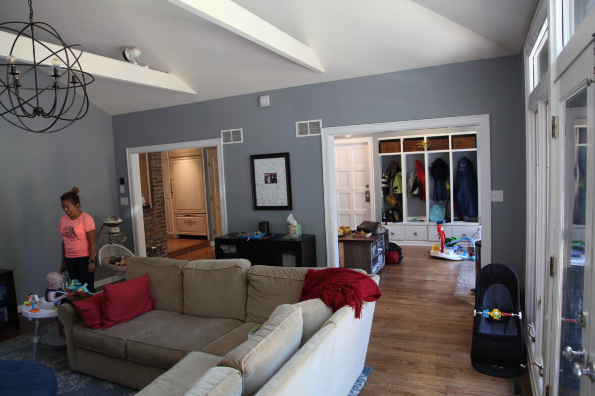
Before
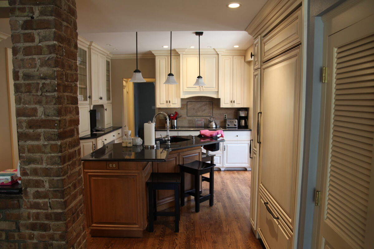
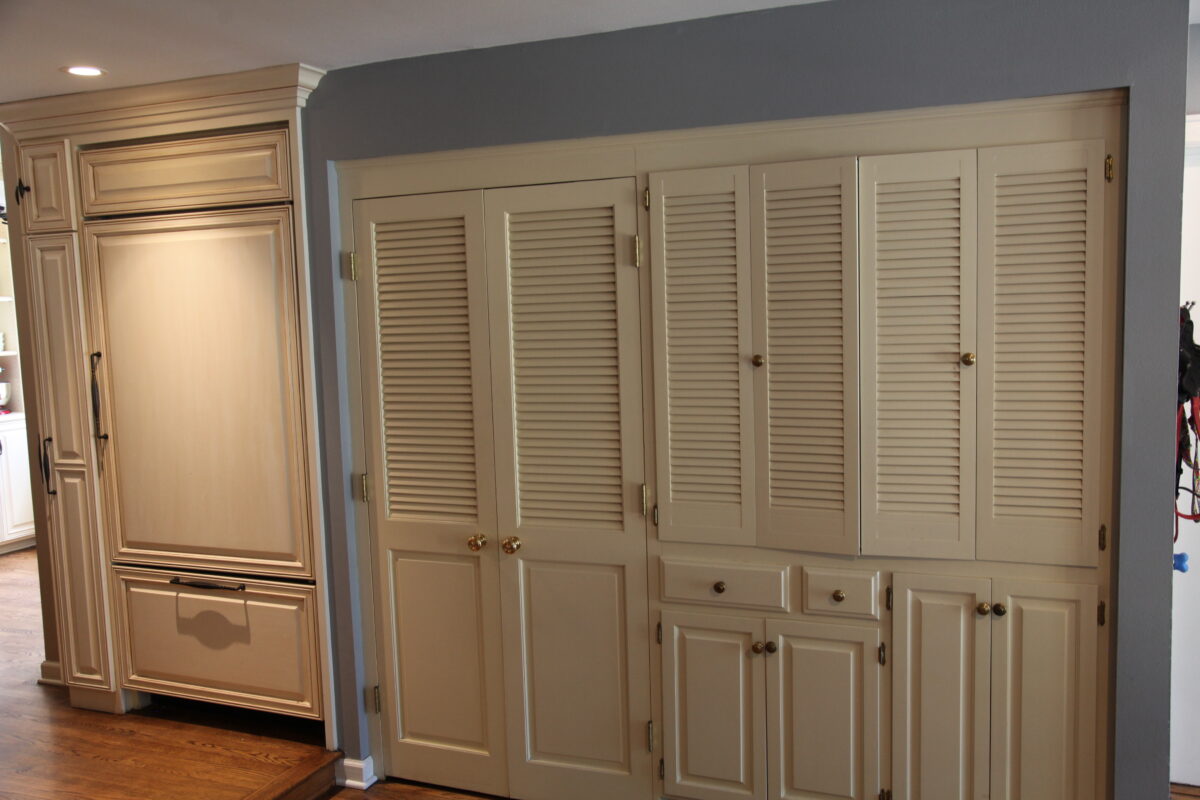
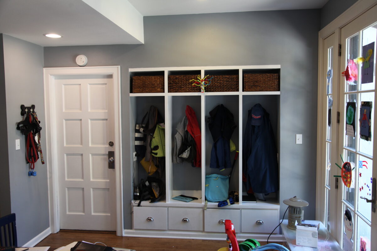
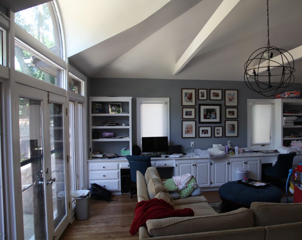
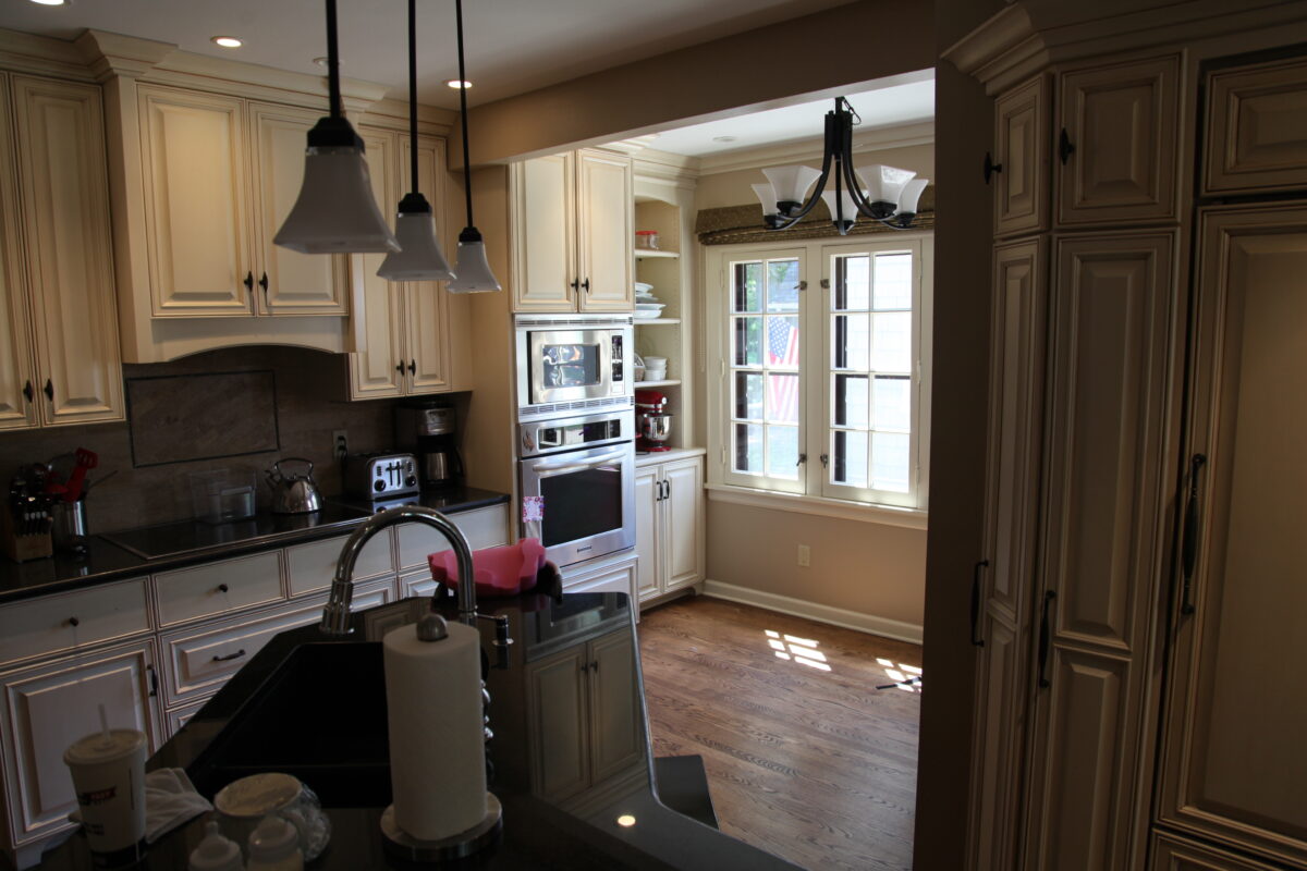
The previous space was crowded and oddly shaped and did not function well as it was disconnected from the rest of the home. It felt cold, dark, and impersonal.
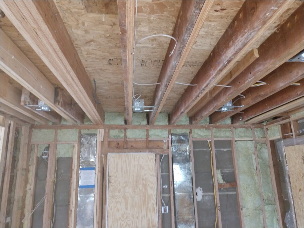
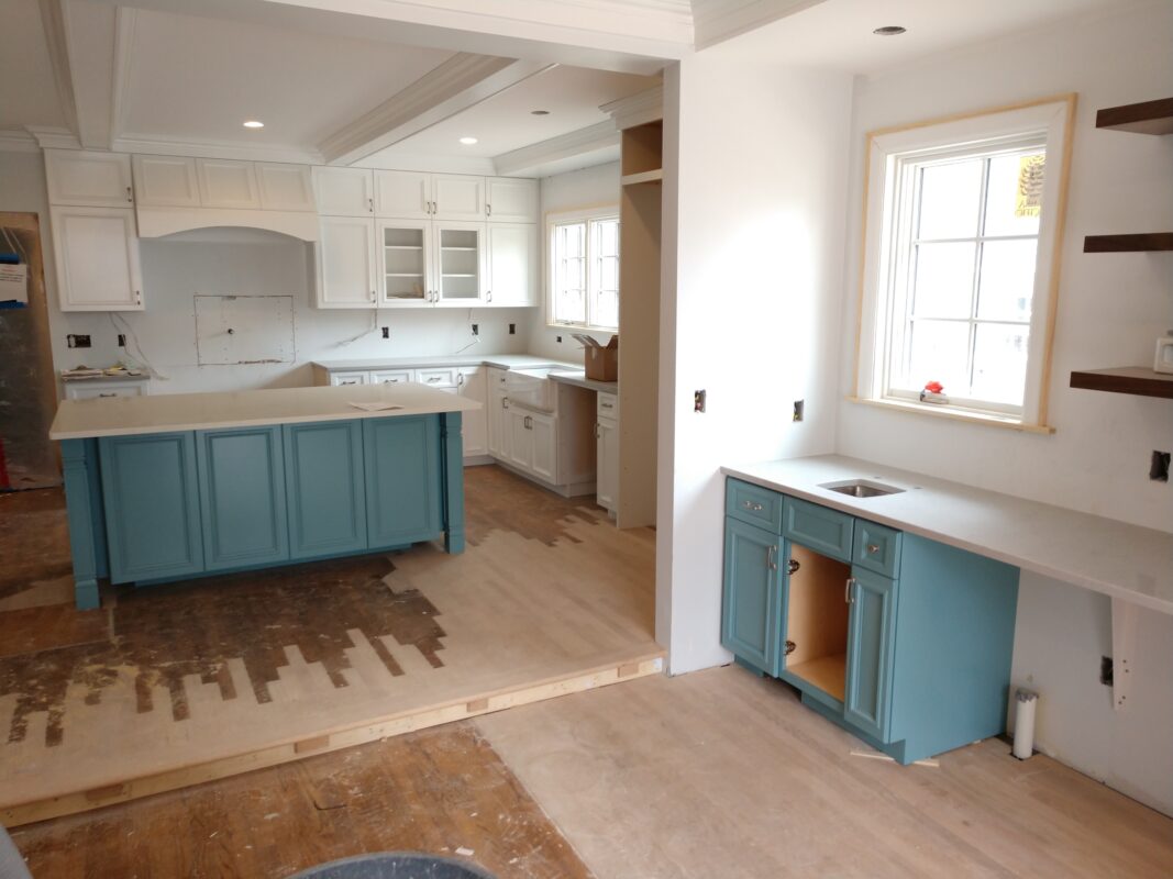
During
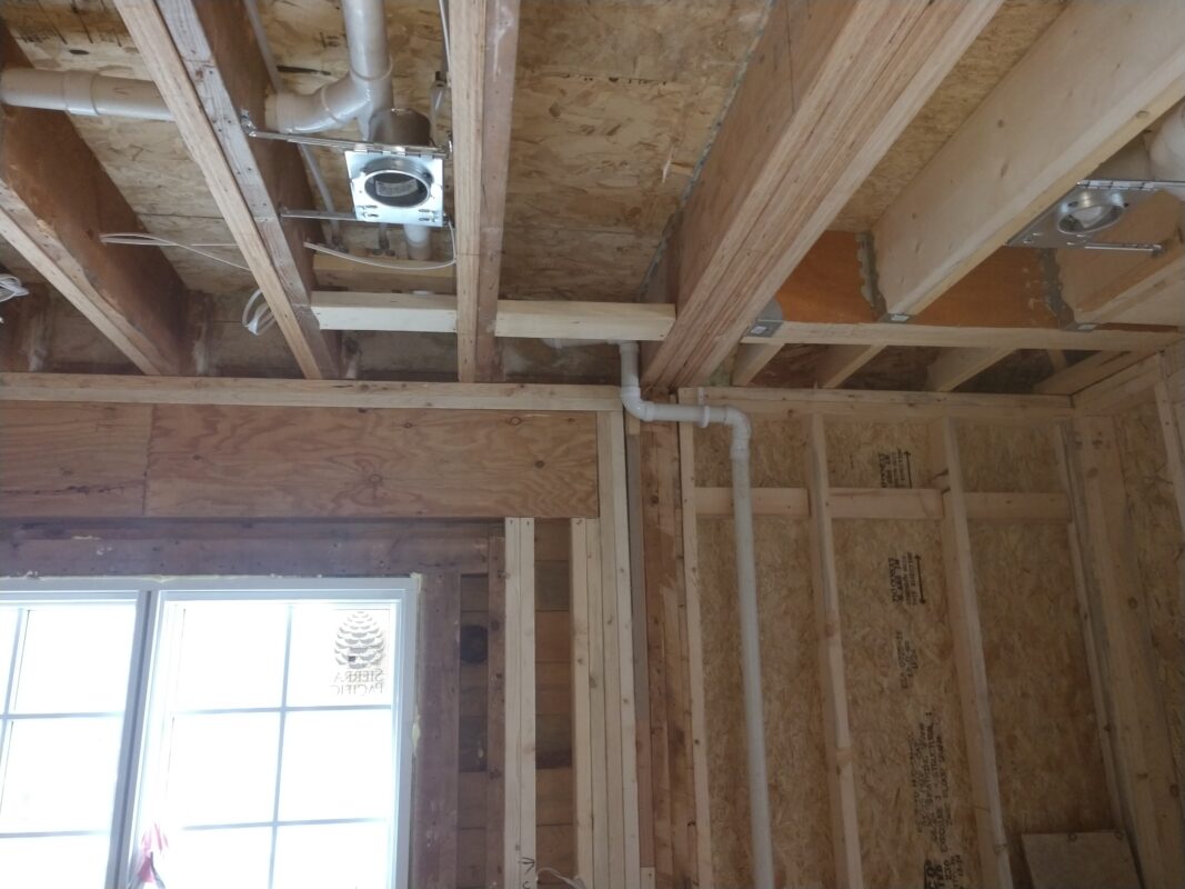
We created additional space by raising the ceiling height slightly in the kitchen and over one foot in the mudroom/back entry. Damaged flooring was removed, and new oak flooring was installed in those areas.
After
The kitchen now fits the architecture of the home, and it no longer feels cramped and crowded. The different areas/zones in the home like the cubbies, work/study station, coffee bar, and wet bar create designated and functional spaces where every item has a spot.
